Collecting Feedback On New Interface Design

Discussion in 'Shapeways Beta Testers' started by nickd0, Feb 12, 2018.

Thread Status:
Not open for further replies.
  1. Greaseball
    Greaseball Well-Known Member
    For historical purposes, as in file version control and editing logging. There are occasions when the model name needs to be changed from the original file upload name so having the history comes in handy to track down the original file on my computer or on a 3D editing web site such as Tinkercad. Plus there are Shapeways based editing actions that could change the uploaded model. If you do wall thickenings those steps are recorded along with what wall thicknesses repairs were used and in what order. Changing the size of the model using the scaling tool is also recorded although the scaling factor is not recorded. You should add the scaling amount that was performed by each scaling operation in the history list for completeness.

    I hope you're not considering removing the history log tab or any other capabilities in the name of simplification.
     
    acd111 likes this.
  2. JoyComplex
    JoyComplex Active Member
    I guess I'd like to know what the impetus was for the change? I never had a problem with the old setup. In my mind, if something isn't broken why "fix" it?

    The live render thing is OK but I never really cared about having that anyway. That would be more useful to have in a listing if anything so that customers could get a better idea of what a product looked like from various angles.

    This improvement feels more like a "hey check out this new thing we I figured out how to do" that leads to no real useful added value.

    Again, maybe if you gave us the rationale for the change - answers to surveys, consistent and repeated complaints fielded by service, you changed your backend with more modern code and it doesn't support the old way, etc - I'd be more open to it. But it seems like change for the sake of change.
     
  3. debdeb
    debdeb Well-Known Member
    I love it! Scroll and rotate don't work on my ipad or iPhone. This was only an issue when I wanted to reorder a pair of earrings. The model has 2 pieces and I wasn't able to zoom out to see the entire image.

    p.s. I miss the green checkmarks. They made me happy :)
     
  4. CosmoWenman
    CosmoWenman Member
    Upon uploading a new design, the most important info is the pass/fail analysis. We used to see red Xs or green checks. Easy to see at glance. Now we have to look for prices or dashes, which doesn't seem to be an improvement.

    I agree with others' comments that there's no need to have such a large render. Anyone uploading is already intimately familiar with their design. I don't think I've ever found any use for the render at this stage. A simple jpg is all that is needed here.

    All the important text info is now crammed over to the side. Having the pricing and materials checks be easily legible is much more important than giant renders.

    Now the option for selling an item is hidden. This makes no sense and seems really bad for usability. There doesn't seem to be a logical reason for this except for the fact that there's no room for all the truly important text info/features now that the renders are huge. Is prioritizing a dead-end render for actual features the right move?

    I would like to revert to the previous interface, which does need improvements. For example: I would like to see the elimination of as many "required fields/categories" as possible, at every stage, on every page. I rarely set up new items for public-facing sale, so this is a waste of time, yet I do it on all new models. Any changes that reduced the amount of scrolling and check-box clicking all over the place would be great. Also, I'd like to be able to apply a percentage markup to my items, or a flat fee, to groups of items, instead of only being able to enter the final retail price. Example: add $10 markup to all materials. Example: add 10% markup to all materials.

    This new interface is a step in the wrong direction.
     
    Last edited: Feb 14, 2018
    bluelinegecko likes this.
  5. stonysmith
    stonysmith Well-Known Member Moderator
    I'm going to slightly disagree. You are correct for the bulk of 97% of the cases, but..
    1) There are still a number of designers that lose tiny details (loose shells) during the upload. They need to see the orphaned shells (or what was non-watertight geometry).
    2) For models that include color (FCS), we really need to see how (if) it was processed during the upload.
     
  6. stonysmith
    stonysmith Well-Known Member Moderator
    I really, really, REALLY desire to see the File history added over in the API.

    I need the file history so that I can compute some statistics.. Average age from upload to 1st purchase, History of age(s) vs total purchases, etc.
    I also badly need to correct/find the file names of some my backup copies. Some times I used a really bad filename such as S1.STL and I need to ensure that I have a proper backup copy of the original files in my local archive.

    Having the file history Name/Date/Size would help me sort it all out.
     
    acd111 likes this.
  7. Good Evening!

    I appreciate the opportunity to provide feedback.

    When I’m designing a user interface I try to focus on the intented interaction of the user. This new beta interface has left me puzzled as to the intent.

    In my application, I click on a model from ‘My Models’ page to view the following information at a glance:
    1. Model
    2. Model specifications (dimensions, surface area etc.)
    3. Material options (what passed and what didn’t)
    4. How successful has this design been printed in the past
    5. How much it’s going to cost me
    I totally understand the desire to showcase the model as it would look like when 3D printed. I think that’s fantastic you can do it live, however; taking over 50% of the user interface for a rendering makes it very difficult for designers to add multiple products to the cart and view the true information we are looking for.

    I would like to see the user interface designed similarly to the previous list but with the capability to click on say a button to enable the live view in a pop-up window. This way you appease those of use looking for information (which is the original intent in my point of view) but you have a bonus of the live preview if we need the visual to finally sell us on buying it.

    Again thank you for the opportunity to respond, but I’m hoping you will continue to evolve your interface back to the original intent: designer wants to know what options do I have and how much is it going to cost ...at a glance.

    Jessica
     
    JoyComplex and acd111 like this.
  8. MrNibbles
    MrNibbles Well-Known Member
    I looked at both old and new again and my basic feeling is that the old model edit page is the one thing here that didn't need any changing. Everything thing is there and easy to find without embarking on a sub-menu hunting clickfest. My only complaint would be display of model dimensions at the top level being in metric without the ability to toggle to inches. If the goal was to have a larger render why not simply add a button to open up a new larger window with an improved render for those who need it? Certainly not everyone designs their own files so they could benefit from the availability of a nice, larger render. So can the people who use the creators to generate key chains and other widgets from 2D images or ShapeJS.

    There are so many places where we could benefit from other system improvements. Faster pricing ability (i.e. setting an initial minimum default markup for all materials in a product), improved facet and tag handling tools, more flexible variant types and/or expanded variant types, customization for store appearances, automated store and product analysis tools, improved searches everywhere, longer display lines for variant model selections, a screening mode for orphaned models (not being sold), more render vector options - literally a zillion other things mentioned by users for several years. Changing the model edit page seems like a wild hair exercise.
     
    CybranKNight likes this.
  9. mkroeker
    mkroeker Well-Known Member
    Folks, I am fairly certain we can all come up with a list of at least ten items that need improving, why oh why are you spending precious time on fixing the one thing that is not broken ?
    Off the top of my head, there is
    • controversial wording of the rejection email message
    • no feedback on supported file formats and sizes when using the drop area for uploading
    • wall thickness check highlighting details without informing that it simply does not handle them
    • rendered images in white and transparent materials still ugly and hard to see
    • materials pages still lacking important information that is buried somewhere deep in the forum (porcelain glazing process limitations, "steel" quality issues, plating compositions and durability,...)
    • pricing interface (heck, the Lego uniform hat guy even posted a javascript tool for you to learn from IIRC)
    • inefficient tracking of printability (items that printed fine in the past still getting re-checked and rejected)
    • no texture import from OBJ
    • unclear implementation status of the user-defined orientation, no feedback if an orientation has been set
    • no bulk deleting of models
    • no cloning of product pages
    • no one-click buying of multiple models that make up a product
    • no way to use logical AND in searches
    • too few Categories, having to put items in the "Mathematical Art" category although they are neither
    • recurring server slowdowns, inability to upload, cloudflare timeouts
     
    Last edited: Feb 15, 2018
    CosmoWenman and CybranKNight like this.
  10. Youknowwho4eva
    Youknowwho4eva Well-Known Member
    Thank you all so much for your feedback! I just wanted to address some comments and concerns.

    Why are we making this change?
    We've received lots of positive feedback on the 3D render on the edit page, the 3D print annalysis page, as well as material renders on the product listings. So we're giving you a large preview from the start that gives you all of these in one.
    Another reason for the change is to give you all the same info in a much smaller footprint. In the old interface, if you were designing for full color, you'd have to scroll all the way down the page. Now you still have to scroll through the materials, but your render is still there for you to view. And you can click the material to see it rendered in that material. As we grow this new format, we'll add the information you need that's missing, and have a better integration with other pages.
    Ultimately the goal is to increase your productivity, as well as make an interface that new users can more easily understand.

    From this Beta start, we're going to diligently address your concerns to give you a tool that functions as you need it to. I know many of your suggestions for improvement are already in the works, and we greatly appreciate them all!
     
  11. MrNibbles
    MrNibbles Well-Known Member
    You don't really need to scroll through all the materials since you have those material selector buttons. If you just want to see color sandstone, for example, you can just click on that button and other materials drop off the page

    It seems to me that a simpler modification would have been to tighten up the top of the page and put the existing material list underneath into a scroll box. That would still allow you to quickly scroll the list to check for auto check results, manual checks, and success rates as before and also see the displayed model render. I think the pain that people are seeing is that while a huge rendered image is nice it comes at the expense of seeing other useful information at a glance or a scroll. Side-by-side (with the huge ginormous render) seems worse than over-under and especially with such a narrow information window that will require clicking into sub menus. I'd rather scroll or swipe than click..

    But of course this viewpoint is coming from the shop owner perspective wanting to put models into their shops. It's possible that your sales data indicates there are an increasing number of orders coming from the model pages directly., i.e. users that don't bother with a Shapeways store but buy things for their own hobbies or to sell on Etsy, etc. In that case they would probably benefit from a ginormous material render on the model page.

    This is a great example of an "improvement" that needs an "opt out" setting somewhere for old school viewing for folks that don't benefit from the improvement.


    model page example.jpg
     
    JoyComplex likes this.
  12. nickd0
    nickd0 Shapeways Employee Product Team
    Hey MrNibbles! You can opt out by removing your self from the beta program. Just go to your user settings and scroll down to Beta Participation!
     
  13. MrNibbles
    MrNibbles Well-Known Member
    Yes, I already had to do that. I'm talking about opting in or out of this display mode once you're done fiddling around with this. Maybe it will end up being more awesome than a triple beef burger with melted cheese and onions. But if not then I'll settle for the plain mini mystery meat patty slider on a stale bun.
     
  14. stannum
    stannum Well-Known Member
    Date could include time.
    But probably the most useful would be a simple hash, like MD5 or SHA1 (it's for differences, not security).
    Same number of polygons moved around can give same file size, but different hash.
    It's both useful for API or manual use (easy to get local tools to compute hashes... and then save time and bandwith to verify & identify files).
     
  15. Greaseball
    Greaseball Well-Known Member
    I'm posting this here because of my previous post about not seeing the history tab...

    I found my file system quickly getting out of control so I came up with a better way of managing it. Everything is centered around Tinkercad and their naming format. Take this product as an example:
    https://www.shapeways.com/product/RMR6K3RKK/hole-plug-0005-star

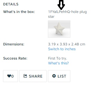
    Tinkercad has a similar letter/number ID as the product numbers have here at Shapeways. For this product the file name ends up being "1FYalLPehhQ-hole plug star" with the "1FYalLPehhQ" part being the Tinkercad ID.

    You don't know the random ID you're going to get until you open a new file in Tinkercad. But once you do you can modify the model name by copying and pasting the ID number into the name and then appending a short description like "-hole plug star" if desired.

    Then I download the model file to my hard drive from Tinkercad and then I upload the file to Shapeways (from my hard drive) where it eventually gets a properly descriptive product name. The Tinkercad and hard drive file names show up as the model name which is visible in the "what's in the box" box although the file type extension does not show up here. That's where a history tab would come in handy to display more information.
    whatsinthebox.jpg
    I think I will survive if the historical information tab becomes unavailable but I would pity those who have been here a long time and have a less structured approach to file management.

    Some other good points about doing things this way:
    1) Ironically you can't search your Tinkercad library using the Tinkercad number/letter ID code unless it's in the model name. Using this naming convention makes it searchable in your account.
    2) Tinkercad has project folders! I can create one or multiple Workarounds project folders in Tinkercad that contain everything for Shapeways and have other folders for other projects. I have no great need for file management organization here, as other people have suggested, although it might come in handy at some point.
    3) I have a directory for each model on my hard drive (using the Tinkercad letter/name ID) so I can gather photos and related information with the model. This directory can also hold various file formats of the model including color formats like x3d in preparation for when a decent HP color plastic process becomes available.
    4) Smaller sized stl files generated by other programs such as Meshmixer or Shapeways creators can be imported into a Tinkercad model and handled the same way as something generated within Tinkercad. You can also append notes to a Tinkercad model which allows you to enter the file name of the imported file which may be located in some other directory on your computer or in the cloud somewhere. If the file is too large for import into Tinkercad you can create a dummy Tinkercad file just to get the Tinkercad ID, and enter the name/path of the large file into the Tinkercad model notes for trace-ability. You can always upload over the initial dummy file sent to Shapeways using the actual geometry file.
    5) I think assembling files into a variant will be easier with this model naming convention. The distinguishing ID code is at the front of the model name so it won't need a long name display box. Also the search function should more easily find it (I hope).

    This may not be the most straightforward way of doing things but it provides a way to back trace and search for a model file in one of three archive locations (Tinkercad, Shapeways, and hard drive) using one ID code. It might be lacking in some respects when it comes to storing different revisions of the same model or time/date stamps but I think each revision will just get a new Tinkercad ID and model file. Or old versions will simply be over-written. Plus you have the Tinkercad file notes capability to mention other specifics like revisions, customer names, etc.

    A similar thing could probably be done using the Shapeways product number instead of the Tinkercad letter/number ID if that's your preference. Or you could generate your own unique codes and use them as a file name basis.
     
  16. CosmoWenman
    CosmoWenman Member
    Now that I've used it a bit more, I have to reiterate: this new interface is bonkers.

    This must be a mistake: is it actually Shapeways' intention that we now have to click on each material individually to see if there are are "possible issues found"? (This is besides having to spot dashes instead of red/green marks. I mean finding the comments about marginal problems, not outright fails.)

    This is a big waste of users' time and just makes the whole uploading/processing experience even more unpleasant than it already is. This new version is astonishingly bad.

    It looks like the only way to opt out of this interface is to opt out of *all* the beta tests, some of which I want to stay in. Please make an option for opting out of only this beta test, or make add a "switch to old interface" option on the interface. (A prominent one, not hidden.)

    I have a bunch of designs to upload soon, so it would be great if this could be done soon. thanks
     
    JoyComplex likes this.
  17. CosmoWenman
    CosmoWenman Member
    There doesn't seem to be a way to opt out of *only* this beta test. I'm in other beta tests, and need to stay in them. But I urgently need out of this new interface.
     
  18. javelin98
    javelin98 Well-Known Member
    Yes, this is a step backwards. It seems to take more steps now to get a new model up onto my store. From the shopkeeper's perspective, it should really be pretty straightforward:

    1. Upload a new product
    2. Check printability issues
    3. Select the materials it can be printed in
    4. Add the markup
    5. Add photos and text description
    6. Choose a category and shop section
    7. Publish

    Is there some way you can put all of that on one page? That would be terrific.

    It feels like a lot of these changes are being done by web engineers who don't actually have storefronts, or are being done without any input from shop owners during the initial design process. For example, the "Edit product with this model" dropdown is now buried lower on the page, and can only be seen by clicking on the "Show Details" link. Guess what, folks -- selling is not a detail. It's the point of this whole enterprise.

    You need to simplify the interface to make it faster and easier to get our models from 3D design to successfully-selling product.
     
  19. baldylox
    baldylox Member
    im having issues with old renders either staying in cache or not being updated properly through the new changes.

    sometimes when my image is rendered on the 3D page, its a file that i uploaded many iterations before. not the current file. in order to see it properly, I go to my shops models page, click the 3D tools button for that model. which populates the old style page with a proper rendering then I can move forward.

    also on the new left menu, why are all materials listed as a big huge scrolling mess. i hated that in the old version. make the sections collapsable some how. better yet, let us set "prefered" or "default" materials some place and only view them. i never use 90% of the materials you offer and dont need to see them.

    the live renders are horrible looking. really bumpy

    the edit model "buttons" need to be easily defined. took me 20min to figure out they were actually buttons. its also not clear the clicking the blue banner swaps between setups either.
     
  20. nickd0
    nickd0 Shapeways Employee Product Team
    Hi everyone,

    Thank you so much for the feedback you have been providing. Hearing directly from you all is invaluable and helps us improve the experience.

    A lot of you have told us that needing to click into each material to see the printing analysis is way too cumbersome for your workflow. To that end, we released an improvement this morning. You can now see the status of your printing analysis for all materials at once.

    [​IMG]

    You can still select a material to see specific checks, without needing to go to the 3D tools page. We hope this change will save you time.

    We are working on more ways for you too quickly find the materials that are relevant to you, but wanted to get this change out as soon as possible. Please give it a try and let us know what you think!

    Nick
     
Thread Status:
Not open for further replies.