
The renderer we currently use for thumbnails in the gallery and the model details pages has its limitations and we’ve wanted to improve these previews for a long time.
The reason being that we want to give everyone visiting Shapeways a better impression of what the actual model will look like. One of the limitations of the current renderer is that it lacks smoothing, which gives ugly results when triangles have large surface areas. Moreover the lack of depth perception in the rendered image, the overall dark look of the gallery and the somewhat odd camera position are things we wanted to improve upon.
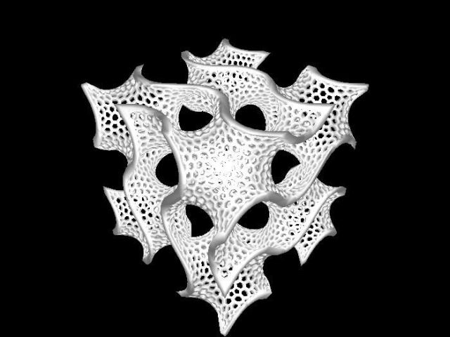
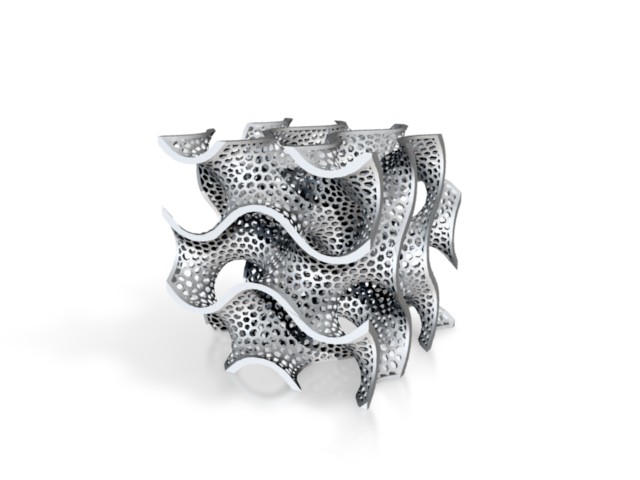
For this reason we have been developing a new render solution. And we want to give you a sneak peek on where we are now. We are very curious as to what you think! Below two images: one of the old and one of thenew renderings. Lots of thanks to Bart, Robert and team for making this possible. Please comment and let us know what you think!
(Renders of Bathsheba’s Gyroid)
Great improvement ! the gallery was not only quite unaesthetic, but it was also very difficult to clearly distinguish the shapes of some models. The gallery will eventually become more homogeneous.
Congratulations to the team behind this.
A couple of questions , though,
The render of this particular model looks shiny, metallic. Would it imply that it will be the default render settings or that we will be able to choose one material type to be rendered ? ( At upload for instance ?)
Same question for the object orientation, will it be deduced by your tools or will it be chosen by the uploader ?
Great work, can’t wait to see it implemented.
Well the first step is going to be to improve the general thumbs on upload.
After that we might implement mulitple camera angles and different materials with a choice to the user to select the ones he likes.
Niceeeeeeee 😀
Good step. One detail; I work with rhino, and for some reason the model always gets flipped 90 degrees backwards when it is shown in the autorender. At some point I’ll probably remember to prepare my files for that, but it could also be nice if one could indicate the bottom and top after uploading, perhaps? Not a big thing but thought I’d mention it.
If the target is to give a better impression, then it should have no smoothing (c’mmon, it is a typical question “why it looks perfect in my 3d app but the object I got is full of visible triangles?”) but some texturing like the materials they try to represent (tiny bumps for WSF or Sandstone). Current renders have a crude smoothing (gouraud?) except for colour prints, in which case they show random depth sorting (pretty funny to see now and then, not at all to try to sell things). Also a midgrey or some pastel background would look better than old black or new white, both are too extreme. But happy you are working on it.
I agree with Stannum: there should be not artificial smoothing in the rendering.
Having the number of polygons being too low in the model could lead someone buying the object to think that the *printing* is bad (because he can see faces that are not in the image) while actually the *model* is bad.
Nice to see progress here. I agree with others that artificial smoothing is a bad idea. However, using a renderer that deals well with large polygons is essential. The current renderer introduces visual artifacts, such as big dark lines on what, in reality, is a perfectly flat plane composed of multiple large triangles. Removing those artifacts does not constitute artificial smoothing. Also agree that the current example is a bit hard on the eyes, too bright or not enough model/background contrast. Perhaps that would be solved by letting the user choose a material. The shadowing and soft reflection look great and should be a general feature of renders. If you implemented the current example renderer today, I would be happy and would consider it a significant step in the right direction.
Looks better. How about a random light pastel color for either the model or background to break up the monotony of white, grey and black. I mean, it’s not Storm Troopers we’re printing here (OK, maybe some people are). Everyone will probably hate the idea, but I’d like to see it rendered with a little color before I dismiss it as silly.
Alternatively, one render in each simulated material on the product page? Some people might be struck by a particular model in black.
No smoothing would be favorite, as the 3D viewer plugin smoothing made my models look very odd.
Excellent improvement! This needed doing. I’m particularly happy to see the overdone perspective going away.
I agree with the no-smoothing crew — if the model will have facets, the image should too. Although I am in favor of artifacts and misrendering of large triangles going away.
I also agree that a little color might not be a bad idea. I agree the black background could be depressing, especially in a whole page of images; but it also gave a good contrast that’s lacking in the new render.
Your example model looks vaguely familiar…it seems to me that when I’ve seen that before, it usually has an accompanying credit. ^_^
Are you planning to also improve the 3D viewer as part of this change?