New Feature : What's in the Box

Discussion in 'Official Announcements' started by Andrewsimonthomas, May 20, 2015.

  1. Andrewsimonthomas
    Andrewsimonthomas Well-Known Member
    Hellooo,

    Yesterday, we released 'What's in the Box' on our Product Page, which will make it clear to shoppers what they are purchasing.

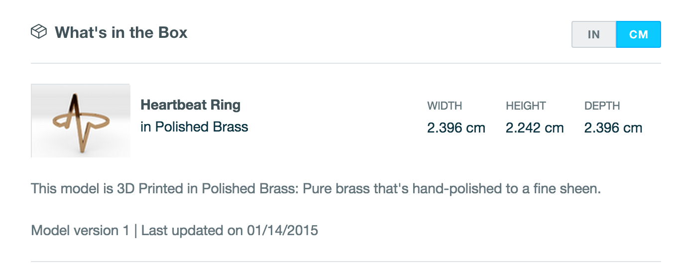
    While this is an important milestone for product sets (which is still an ongoing project without a set ETA), we are excited to share this feature today. This section sets shopper expectations about what each product will include. For example, a shop owner may share a great photograph of her pendant with a necklace chain. This section can now help to clarify exactly what the shopper will receive in the box: the pendant.

    In this section, we describe:
    Name of product
    Dimensions of the model in inches and centimeters
    Summary of the selected material for a preview of what will be purchased
    Model version for shoppers to see which iteration they're purchasing
    Last update date for shoppers to see the latest activity for a model

    What's in the Box is responsive and beautiful and should help improve the shopper experience.

    png;base64dc3ed664cdbc8e32.png

    ~Andrew
     
  2. MrNibbles
    MrNibbles Well-Known Member
    Perhaps you should use a render to show what's in the box for clarification, as opposed to an uploaded photo.

    For example here's a Lotto scraper I have in a photo with a key chain and a key, which are not included with a sale but for clarification purposes it may still not be clear to everyone (as in the case of your example for a pendant and a chain).

    scraper_in_the_box.jpg


    Also related, some material renders are difficult to see even when large so a tiny thumbnail render preview in the box is worse. I'd probably go with the old style generic render if there was a way to choose a thumbnail render for this preview. For example WSF default images can be washed out.

    WSF render
    [​IMG]


    old style render
    [​IMG]

     
  3. sbhunterca
    sbhunterca Well-Known Member
    And all this would be unnecessary if designers would just write a proper product description in the first place, and control their customers' expectations from the start...

    Steve Hunter
     
  4. Andrewsimonthomas
    Andrewsimonthomas Well-Known Member
    Part of the goal is to create a standardized way of doing this. There are so many cases where someone who just came to shapeways for shopping wouldn't even consider that the product image contains extra information, and while product descriptions are good they certainly aren't as eye catching as What's in the Box is.
     
  5. mkroeker
    mkroeker Well-Known Member
    As the others noted, this is bound to be confusing except in the trivial case where one would not even need this new feature to understand what one
    is about to buy - when the designer uploaded a photo, chances are that
    (a) it shows a typical use case - earrings worn with hooks, assembled&painted car on track layout, phone in case, cap on camera lens etc.
    and/or
    (b) the designer did this because the automatic render is suboptimal.
    Also this new block takes up lots of screen real estate on the model page - wouldn't it make much more sense to put this information somewhere on the shopping cart or checkout page, where you could also add a general disclaimer about possible printability issues etc ?
     
  6. Nvenom8
    Nvenom8 Member
    Just posting here what I said about it on facebook because I think this is important to consider:

    >I really like the feature, but can it be placed *below* our description field? The customer already had to scroll to see the description by default, and now it's below the "What's in the Box" which looks very much like a footer. If I were an oblivious customer, I think I would miss a lot of descriptions. On some of my products with sets and links in the description field, this will hurt my sales.
     
  7. Nvenom8
    Nvenom8 Member
    I should also note that I agree wholeheartedly with the idea that it should always be a render in the WITB section to eliminate the confusion that scale items and other set-dressing pieces in uploaded photos could cause.

    I think a WITB section at the *bottom* of the page would be excellent for managing customer expectations and providing essential information like dimensions in an uncluttered and crystal-clear fashion.
     
  8. barkingdigger
    barkingdigger Well-Known Member
    Just had a look - what a waste of screen space!

    It does nothing useful: the image is ALREADY on the product page, the material description is ALREADY on the product page, and it gives the buyer unnecessary info like filename (good thing I didn't call the STL something obscene, eh?) and bounding-box numbers that mean very little because they aren't meaningful dimensions of the product. (See https://www.shapeways.com/product/A74VKWM2A/1-35-bedford-ql- truck-wheel-hubs?key=5d639a031ada8a7e748d8cc6a3abbaee for an example of this meaningless data, where the box does NOT represent the dimensions of the five different parts, which are sprued together.)

    And while you waste resources on this, basic fixes like adding "1:35 scale" to the featured Miniatures filter list are still beyond your grasp.

    Anyone from SW care to comment?
     
  9. MrNibbles
    MrNibbles Well-Known Member
    I don't think the box is a waste of space because there is customer confusion with so many materials and photos and renders. However I'm not sure if customer "analysis paralysis" caused by too many images and options will be solved by simply adding another tiny image. How micro-small is that image on a mobile phone? It's practically useless in some material renders even on my laptop. There's a fundamental problem of the image bar containing way too much stuff that is a mix of Shapeways renders and uploaded photos, renders, etc. And now potentially more materials. Uggh. They need to split up somehow.

    Personally I'd rather have the image bar limited to images uploaded by the store owner. It's fine if the Shapeways renders appear when a material button is clicked from the upper right hand corner Products/First to Try zone in it's own dedicated area or as a pop-up. You could do something like use the top photo area transformed into a What's in the Box using an officially sanctioned larger and easy to see Shapeways render. Then have a second photo box below that is exclusive to uploaded images with the image bar. That's allows Shapeways to micromanage their material presentation and the store owner to micromanage their photos and preferred (and potentially superior) renders without stepping all over each other.

     
  10. MitchellJetten
    MitchellJetten Shapeways Employee CS Team
    while eating my dinner as we speak, i did want to give you an heads up, our dev and product team are working on improvements and fixes.
    like for example having the box shown below the about this product section rather than above.

    Back to eating
    Mitchell
     
  11. Hi everyone,

    Thanks for your great feedback! We are making several changes right now which should be available shortly. Really appreciate your comments, as they are helping shape how we think about the feature.

    Stay tuned for updates!

    -Allessandra (Product Manager)
     
  12. Nvenom8
    Nvenom8 Member
    Oh wow, good catch. I definitely give some of my files weird/obscene/non-descriptive names, or just names that differ from the final product name. I wouldn't necessarily want the customer to see those, if only because those that don't match would be confusing.

    I also tend to use obscenities as variable names in my html/javascript because they're easy to remember, but that hasn't caused any issues so far.
     
    Last edited: May 21, 2015
  13. Hello,

    We just released two new improvements for 'What's in the Box' based on yours and others feedback!

    1) 'What's in the Box' is now below the product description on the product page. It is also below videos if you have a video.
    2) We removed the 'Dimensions' section underneath (and separate from) 'What's in the Box' as it became redundant.

    Thanks for your great feedback and we will be continuing to improve 'What's in the Box'. Top of mind is the image shown and how to optimize that for everyone.

    Best,
    Allessandra (Product Manager)
     
  14. Nvenom8
    Nvenom8 Member
    That's much better. Looking at it now, it would be okay (maybe better?) if it were above the shortlink and the tags, as those have always seemed like footer material to me anyway. I definitely agree that it ought to be below description and videos, though. That was a huge improvement.

    If it were left as-is at this point, I would be happy with it. These are just tiny tweaks I'm suggesting at this point.
     
  15. MrNibbles
    MrNibbles Well-Known Member
    Any left overs from dinner? I'm hungry!
     
  16. stonysmith
    stonysmith Well-Known Member Moderator
    I still think the <hr> tag that is below "What's in the Box?" is in the wrong place.. It makes it look like the information below that line is something else.
     
    Last edited: May 21, 2015
  17. panguver
    panguver Well-Known Member
    Hi,

    Would you like to add the product weight info in addition to dimensions of "What's in the Box"? It would be logical solution.
     
  18. stop4stuff
    stop4stuff Well-Known Member
    This would then enable the more astute to be able to calculate the volume, base price and owner's markup for an item = definitely not on!

    Paul
     
  19. MrNibbles
    MrNibbles Well-Known Member
    Less of an issue for models that use machine space in the pricing equation?
     
  20. panguver
    panguver Well-Known Member
    It would be very good if pricing will clear for all, no problem. It will REALLY problem for Shapeways if ordered earrings becomes too weight and (as example) will injure to buyer. After similar experience dissatisfied customers will leave the ranks of buyers of Shapeways and will go to #### competitor with full clear info about sold goods.