PLEASE!

Discussion in 'General Discussion' started by HazelwoodModels, May 30, 2013.

  1. HazelwoodModels
    HazelwoodModels Well-Known Member
    Please can we have the previous front end.

    The split between Shop/Make only frustrates getting to where we need
    to be.

    Cursor naturally travels the right-hand margin, and the tab at the top
    right has been useful with all the options to serve the situation - this has
    now been lost

    The page does not give who is logged-in.

     
  2. Bathsheba
    Bathsheba Well-Known Member
    There's an avatar icon at the top right, it does seem unnecessarily tiny but it's there. If you don't have an avatar image uploaded I guess it might not tell you much? I hope it gets replaced by text in that case, but don't have an easy way to check.

    I'm in favor of the Shop/Make split because what I like about Shapeways is non-maker customers. They're the ones giving me money, so I want the front page to be all about them. When I visit I'm coming in through the my-models page anyway.

    Overall I'm OK with the new design. There are a few things I'd change. The navigation and color scheme are simple but that's not a fault: IME users like it! Transparency is good.

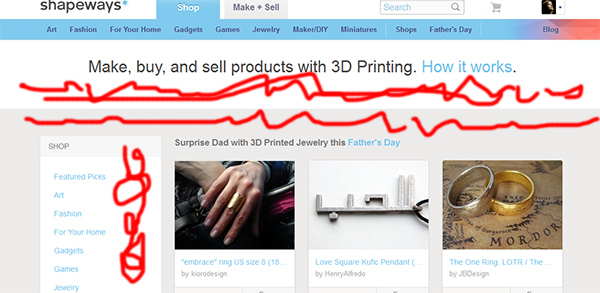
    I'd wish to change the light-blue-on-white text. I find that color combination particularly difficult to read, to me the Shop menu at left is barely legible.

    I do think there's too much whitespace...why so much blank in the prime above-the-fold real estate?
    shap_white.jpg

    The one link I'm missing -- which was also missing in the old site -- is a direct link from the maker page to private messages. I wish that were in the user-icon menu at upper right...I get many private messages but few "notifications", so I'd love to see that replaced or combined.

    Well I guess that's worth what y'all paid for it! Seriously about the blue-on-white text, though. Old people who can't see very well? They shop a lot. True story.

     
  3. MitchellJetten
    MitchellJetten Shapeways Employee CS Team
    Hey Bathsheba,

    The notifications are still there and will show up if you have a new message:
    nav.JPG

    Private Messages will eventually be integrated in the notifications, but am not able to provide you with more details yet.
    I'm sure our Product team will be happy to provide more details soon :)


    As for the rest of the feedback, I've forwarded it to our product team!
    I do have to agree a bit on the blue-on-white text :)

    Mitch
     
    Last edited: May 31, 2013
  4. HazelwoodModels
    HazelwoodModels Well-Known Member
    I think a hierarchical menu running down the right hand gutter traveling with the
    cursor bar, would be unambiguous, and allowing major jumps around the site..

    Menus selections also need to be unique and without redundancy
    - My Models, My Shop, My Sales, and lost amongst them is
    Materials!
     
    Last edited: May 31, 2013
  5. Youknowwho4eva
    Youknowwho4eva Well-Known Member
    Thank you guys for your feedback! Please be sure to let us know on this thread what we can do to improve.
     
  6. HenrikRydberg
    HenrikRydberg Shapeways Employee Design Team
    Hey Bathsheba.
    I hope our latest update answered some of your wishes on the navigation readability.

    Thanks for taking your time to give us feedback.
     
    Last edited: Jun 6, 2013
  7. Bathsheba
    Bathsheba Well-Known Member
    Much appreciated, I noticed the darker blue is more legible. Ever since the day in like 1997 when an 84-yo guy wandered onto my site and bought everything, I've given thought to keeping things legible for that set. They have all of the moneys...he's still a customer.

    I like the menu on the right better too. If something's going to be pushed out of frame, let it be redundant navigational sugar, rather than MY PRECIOUS CONTENT. :)

    Thanks!
     
    Last edited: Jun 7, 2013